


Key takeaways
Winning ads sell the click, not the product. An effective creative focuses on one clear value proposition instead of explaining the entire product in detail.
Copy needs to be benefit-driven, specific and fluent. Rather than talking about features, advertisers should highlight tangible and easy-to-understand business outcomes for a specific vertical, job title, use case or integration option.
Tension and borrowed authority increase engagement. Using questions or demands and naming known brands and creators are two of the most effective ways to increase engagement for B2B SaaS ads.
Native looks beat flashy designs. Ads with a design similar to the organic content of the respective social media platform perform better because they are seen less as promotions by users.
Salient colors and human faces are effective scroll stoppers. Bright colors, high contrast and human faces conveying emotions such as confidence or excitement are the best visual scroll stoppers for B2B SaaS ads.
Ad volume and runtime reveal winners in public ad libraries. To find winning ads fast in public ad libraries, it’s recommended to look at the total amount of ads tested, as well as the individual run time of an ad, using free browser extensions such as AdLibNote or adspo.co.
Hey 👋🏼 I'm Fabian, great to have you here. In my newsletter "Get Hooked! Marketing", I share proven tactics from the trenches of B2B SaaS advertising every week. Built to make you a top 5% marketer.
Copy the "Persona Framework" I use to repeatedly build simple static ads that generate six-figure B2B SaaS revenue. Backed by more than 6,000 hours of creative testing and $5M+ in ARR generated.
Table of contents
What winning B2B SaaS ads have in common
Copy patterns
Design patterns
20 B2B SaaS ad examples and why they convert
How the ads were picked
Image ads
Video ads
Search ads
Thought leadership ads
How to apply these examples to your own campaigns
What winning B2B SaaS ads have in common
Over the past three years, I have generated $5M+ in ARR on Meta, LinkedIn and Google for some of Germany’s fastest-growing, post-Series A B2B software startups.
Every one of my winning ads that reached $100K in annual recurring revenue shared one or more of the following 11 copy and design patterns. Each of them provides a distinct reason for viewers to stop scrolling and start clicking.
Copy patterns
Winning ads sell the click, not the product. On social media or a search results page, people decide in seconds. Showcasing an entire product isn’t just impossible. It’s counterproductive. That’s why successful ads pick one clear value proposition wrapped in one compelling hook to drive the click and let the landing page do the heavy conversion lifting.
Winning ads focus on benefits, not features. Most prospects only care about three things: making more money, saving money and reducing workload and stress. However, SaaS advertisers often lead with feature-driven copy such as “The all-in-one AI software solution for businesses”. A better approach is to start with numbers and results, then explain the product and its features.
Winning ads have specific copy. Specificity creates relevancy and relevancy drives engagement. Successful B2B SaaS ads do not address “businesses”. They address specific verticals, job titles, use cases or integration options with existing software solutions.
Winning ads have fluent copy. The fluency heuristic is a mental shortcut each and every one of us uses subconsciously to assume that information that is easier to process is also more valuable and true. Conversely, complicated or overly clever copy will most likely work against the advertiser.
Winning ads create tension. An ad that includes an open question or a direct demand creates way more cognitive tension than just a plain statement. Both need closure (by answering the question or by evaluating the demand), which successful SaaS ads use to increase engagement. Humor is another way to create cognitive tension and a great way to stand out in a feed of rather serious B2B messaging.
Winning ads consider awareness levels. Each prospect in a market sits at a different awareness level. Some are still unaware of the problem a product solves, while others know everything about the solution and are basically ready to buy. A successful B2B SaaS ad addresses one awareness level at a time.
Winning ads borrow brand authority. Linking an ad and its offer to a known brand or individual within the same or a similar niche is a powerful thing. I regularly review B2B SaaS ads, and hooks like “What Notion does better than anyone else in advertising...” work like a charm.
Winning ads don’t ignore the ad description. On networks like Meta or LinkedIn, ads can include additional descriptions and headlines that sit outside the actual creative. Successful B2B SaaS ads do not neglect them but rather treat them as an opportunity to provide additional context. A bridge, so to speak, between the ad and the landing page.
Design patterns
Winning ads have a simple design/low-touch editing. It’s not just an ad’s copy that needs to be fluent and easy to understand; its design and editing need to be too. This also matters because simplicity is a differentiator. While most SaaS brands rely on polished, branded creatives, simple ads that look like organic content are less likely to be read as an advertisement, which makes people far more likely to engage with them.
📝 Note: Simple does not mean ugly! You can still produce an ad that is successful and on-brand at the same time. But the design and editing should always support the ad’s core message and its main job: making people stop scrolling and start clicking. Everything else is unnecessary load.
Winning ads use salient colors. Successful B2B SaaS ads use visual tones that have a high degree of contrast, brightness or saturation in order to instantly stand out in a feed or on a search results page.
Winning ads include human faces. Humans are wired to notice human faces faster than any other object, which makes them great visual scroll stoppers. Especially when they convey emotions like confidence or excitement.
20 B2B SaaS ad examples and why they convert
How the ads were picked
All of the following ads were sourced from the public ad libraries of Meta, LinkedIn and Google. They include some of my own winning ads (Superchat) as well as ads from B2B SaaS companies I take heavy inspiration from.
💡 Tip: Free tools like AdLibNote or adspo.co make navigating ad libraries much easier.
To find winning ads in public ad libraries, I look at two things:
The total number of ad creatives, including active and inactive ones. This number indicates how much effort is put into testing and how important that channel likely is to the company.
The total runtime of ad creatives. Winning ads are usually the ones that are kept active for several weeks because they bring in consistent revenue.
Image ads
Example 1 - Motion (Link to ad library)
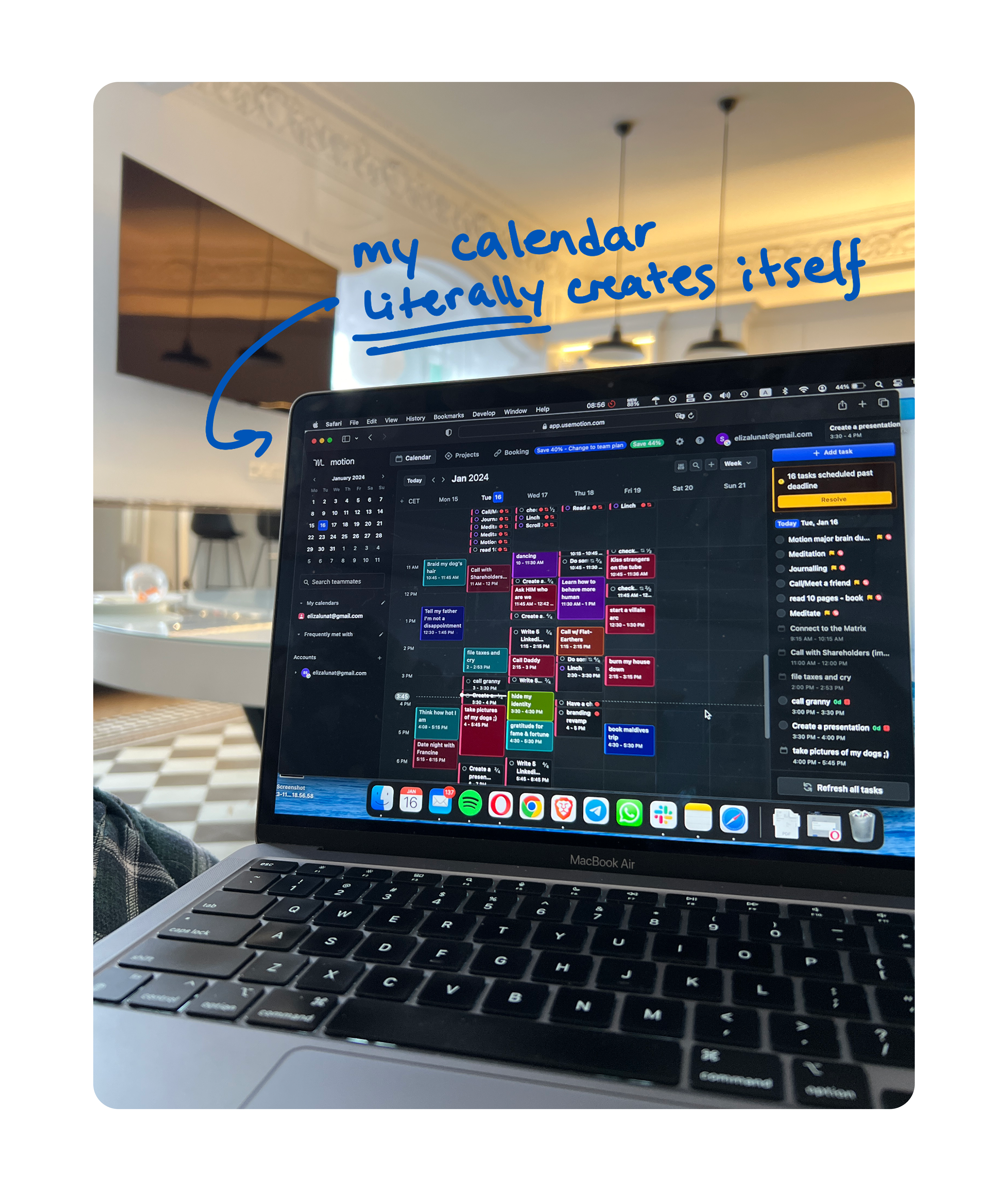
Total ads tested: ~19,000 (Meta)
Runtime: 707 days
Why it converts: The creative looks like a photo someone snapped in a café and scribbled on. That’s simple, low-touch design at its best, seamlessly blending in with organic content on Instagram, for example. The handwritten line “my calendar literally creates itself” then sells exactly one value proposition, while the colorful calendar blocks make the ad pop.
Example 2 - Motion (Link to ad library)
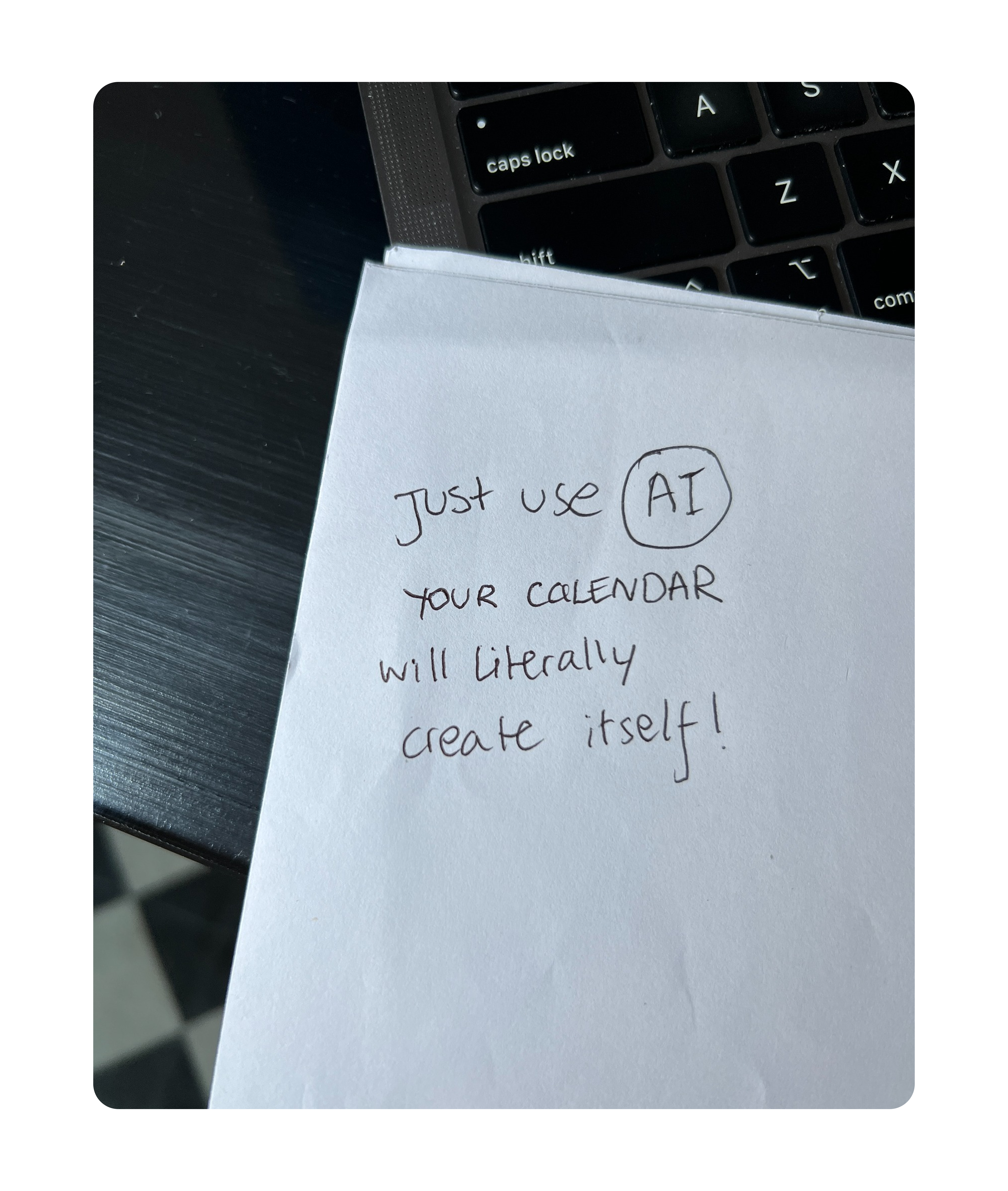
Total ads tested: ~19,000 (Meta)
Runtime: 752 days
Why it converts: Simpler than the previous ad and it ran even longer. No UI, branding or polish, which is exactly why it performed. The copy opens with a direct demand (”Just use AI”) followed by a bold, easy-to-grasp promise, creating tension while staying highly fluent. Finally, the headline handles the two biggest objections before the click: price (”62 cents a day”) and risk (”100% free”).
Example 3 - Envato (Link to ad library)
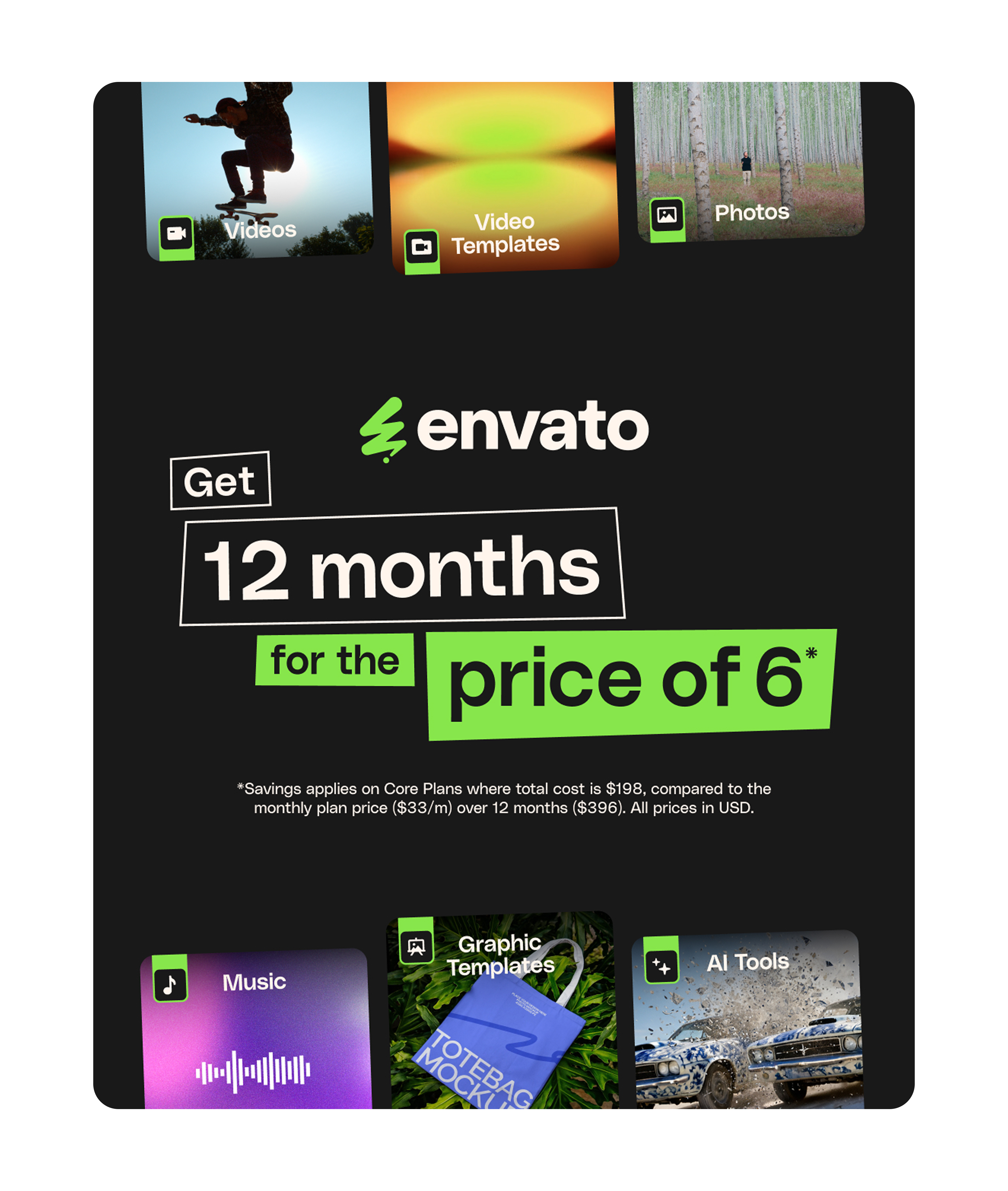
Total ads tested: ~3,500 (Meta)
Runtime: 80 days
Why it converts: This ad speaks to prospects who know what Envato offers, so it skips the explanation and goes straight to the offer. “12 months for the price of 6!” is a very tangible value proposition and the neon-green-on-black design choice makes the ad hard to miss.
Example 4 - Superchat (Link to ad library)
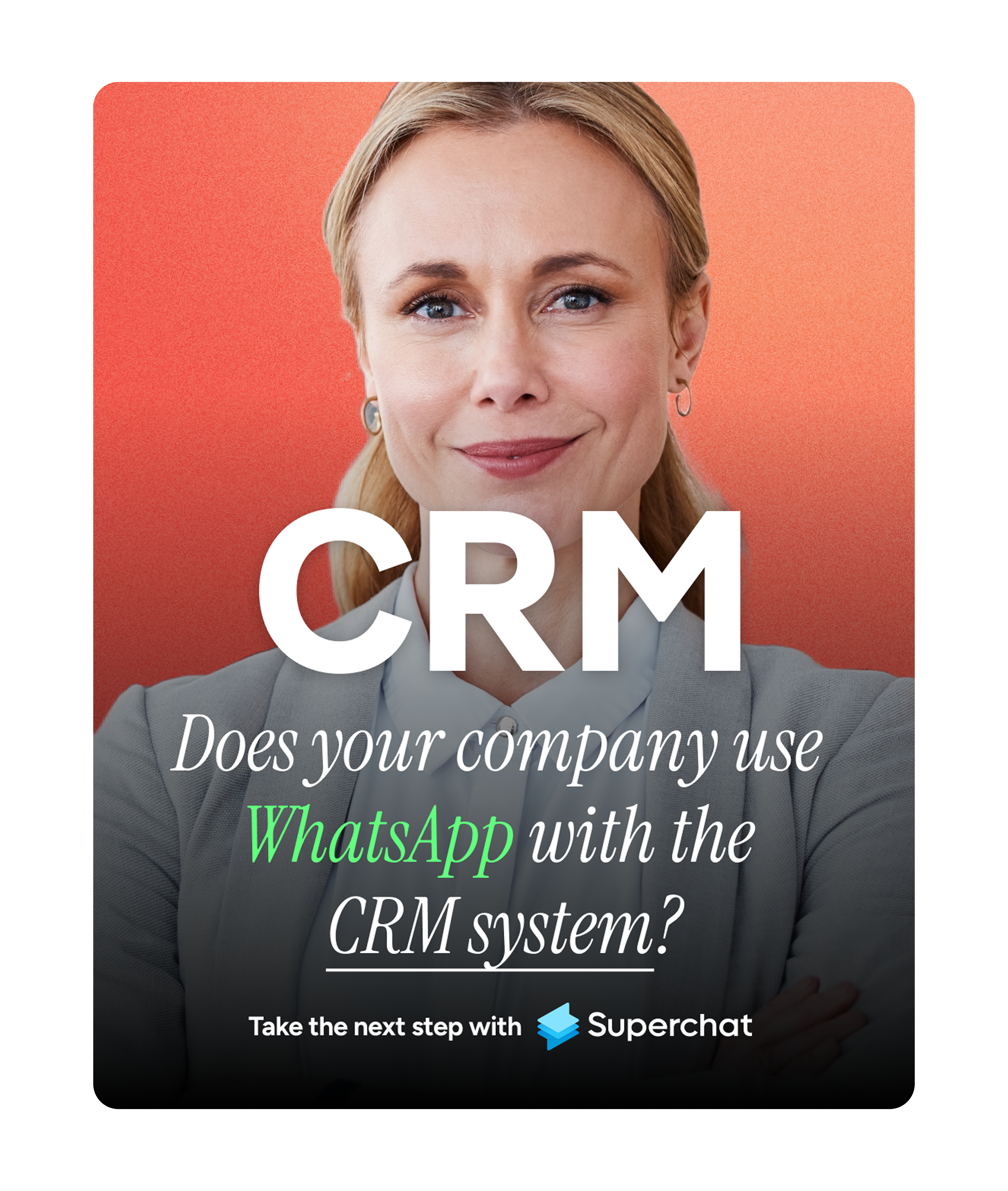
Total ads tested: ~3,500 (Meta)
Runtime: 198 days
Why it converts: This creative checks almost every box: salient colors, a confident human face and copy that doesn’t just address “businesses”. Instead, the text mentions a concrete integration use case with WhatsApp and CRM systems while the question-type hook creates tension. The ad description then goes deeper into possible use cases, creating a bridge between the ad creative and the landing page.
Example 5 - Superchat (Link to ad library)
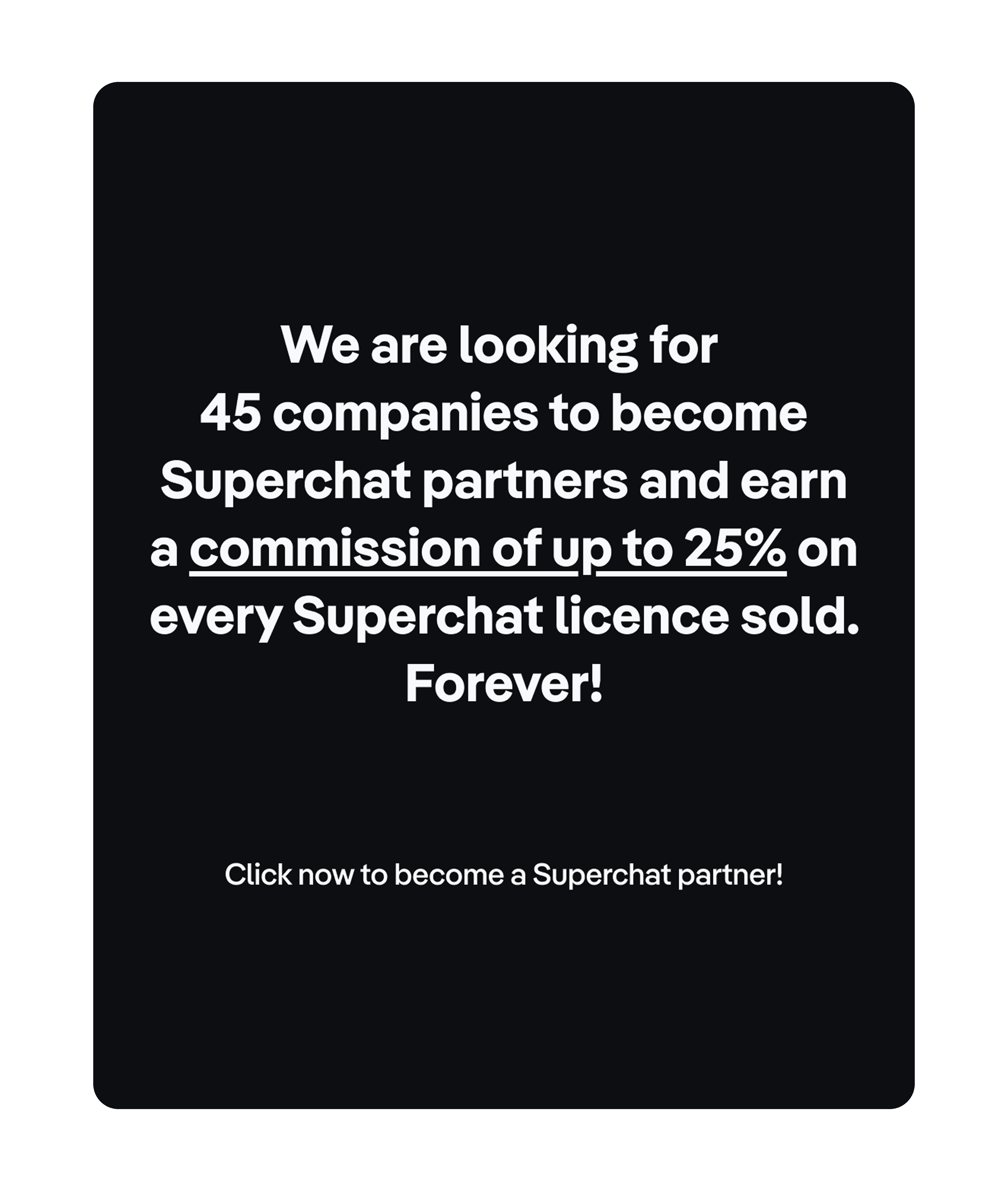
Total ads tested: ~3,500 (Meta)
Runtime: 54 days
Why it converts: White text on a black background, nothing else. This ad is probably the best example of why creatives don’t need to have a flashy design. The color choice creates a high contrast, making the ad stand out immediately, and the hook delivers a value proposition most businesses wouldn’t want to miss out on.
Example 6 - monday.com (Link to ad library)
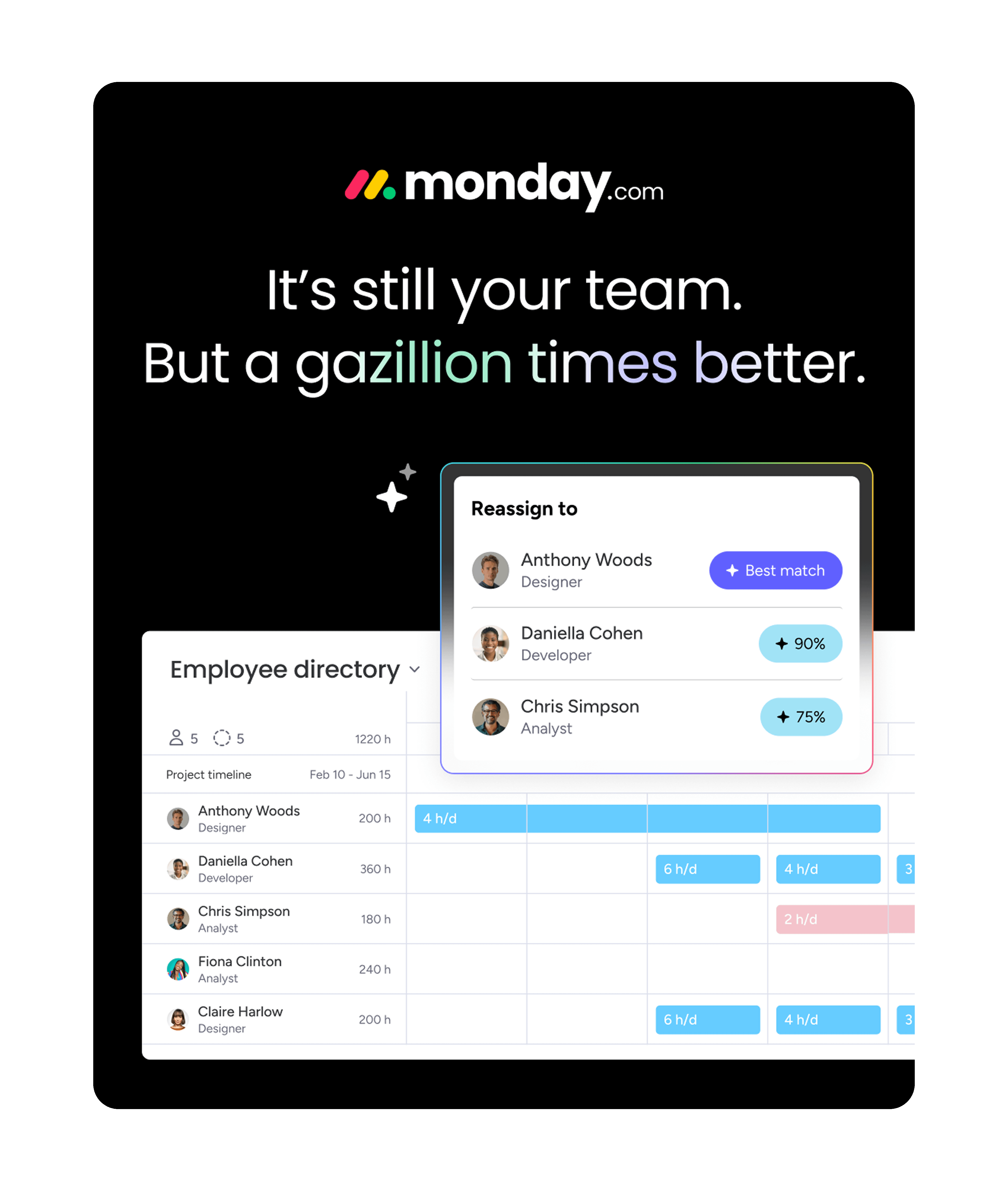
Total ads tested: ~3,300 (Meta)
Runtime: 121 days
Why it converts: “A gazillion times better” is a playful exaggeration that stands out in a feed full of serious B2B claims and the color gradient pulls the eye right to it. The ad description adds tension with an open loop: “There’s a reason why 180K+ customers use monday.com... See why.” Viewers know there’s an answer but they have to click to get it.
Example 7 - Perspective (Link to ad library)
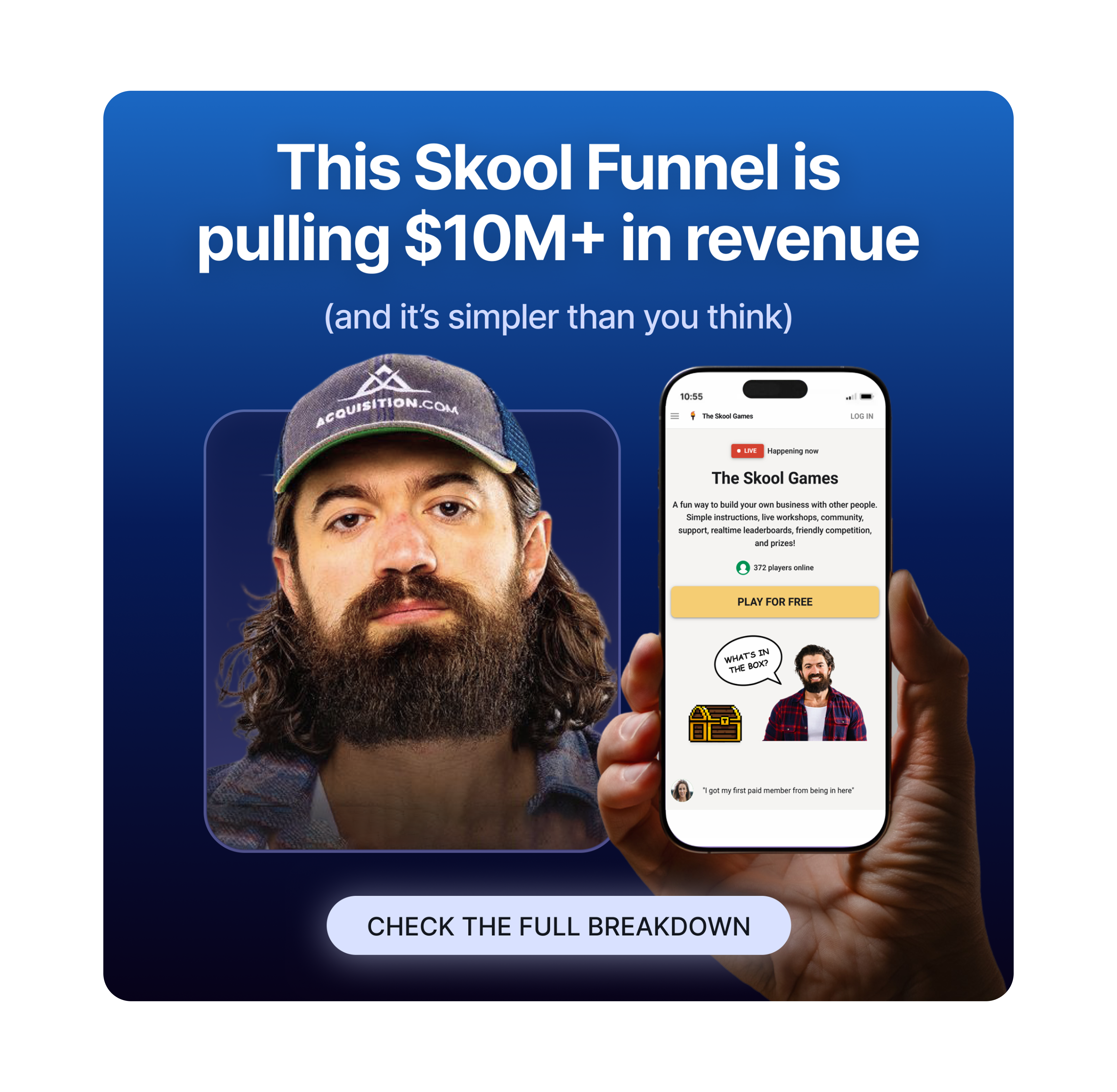
Total ads tested: ~2,100 (Meta)
Runtime: 71 days
Why it converts: Alex Hormozi is instantly recognizable to anyone in online marketing and his face does double duty: it lends his authority and works as a visual scroll stopper. The ad is then complemented by a compelling hook, promising insights into a $10M+ online marketing funnel.
Example 8 - Fibbler (Link to ad library)
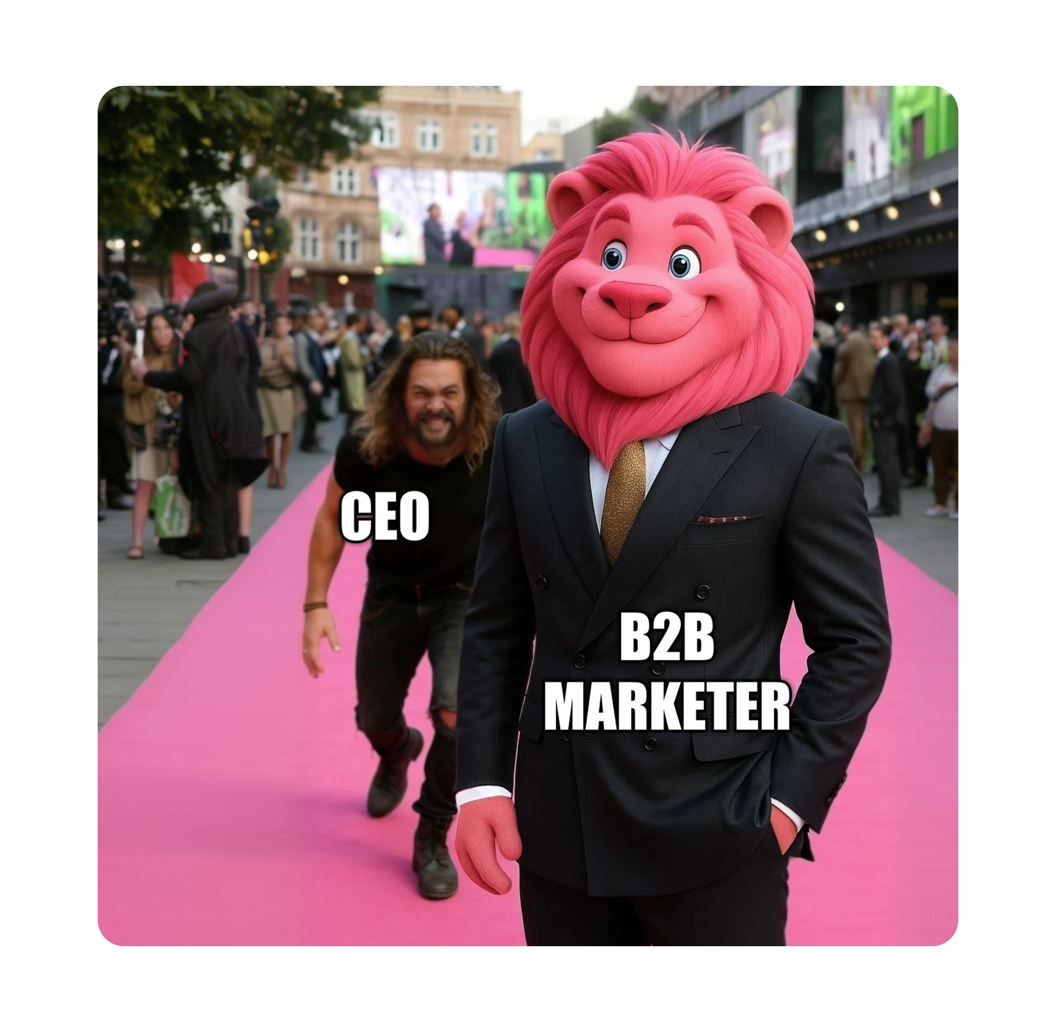
Total ads tested: ~280 (LinkedIn)
Runtime: 166 days
Why it converts: The meme-type creative speaks directly to “B2B marketers” and creates curiosity: viewers will pause for a moment to assess what’s happening in front of them. The ad description then reveals a conversation many B2B marketers are very familiar with:
CEO: “Prove that our paid ads are working.”
B2B marketer: “Well, it’s complicated because...”
A humorous and subtle take on the struggle of attribution and the introduction of Fibbler as the solution.
Example 9 - Perspective (Link to ad library)
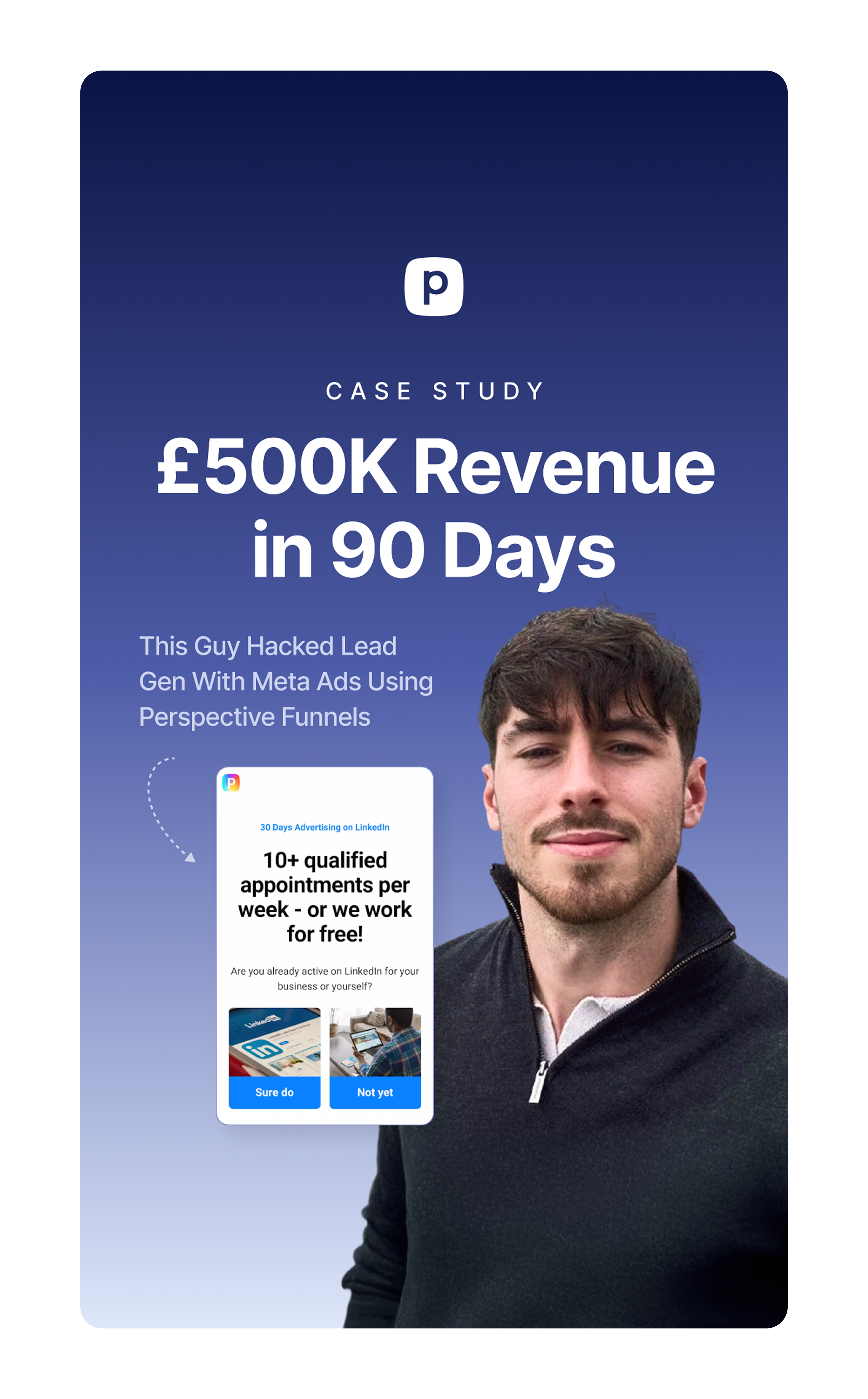
Total ads tested: ~2,100 (Meta)
Runtime: 106 days
Why it converts: The ad leads with a crystal-clear value proposition of “£500K in 90 days” and establishes specificity by calling out the Meta ads use case in the subheadline. On the right, the testimonial acts as a visual scroll stopper, while the UI shot in the middle teases the product.
Example 10 - Lovable (Link to ad library)
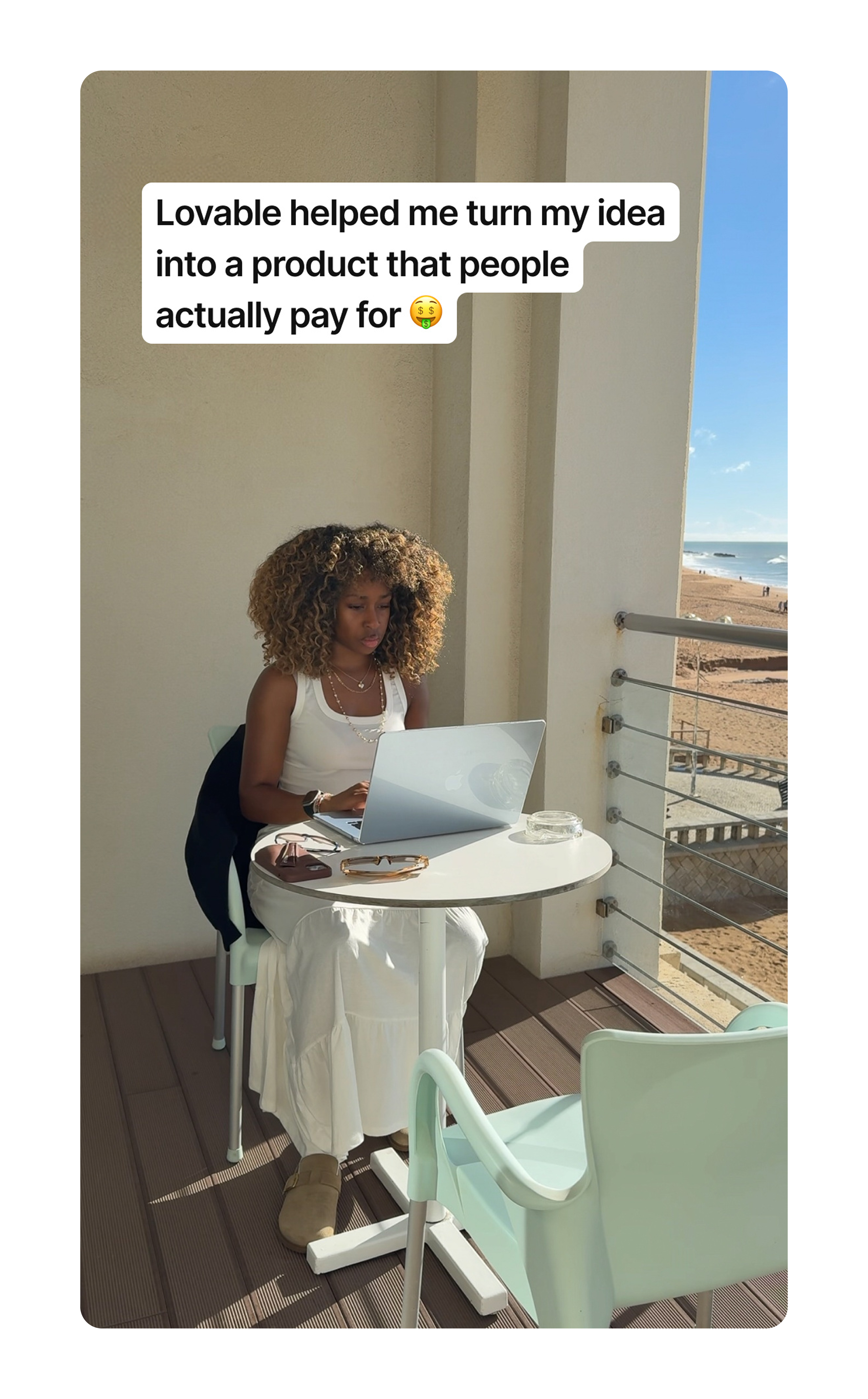
Total ads tested: ~630 (Meta)
Runtime: 119 days
Why it converts: Another great example of how to blend a B2B SaaS ad into an organic feed. The creative looks like a screenshot taken directly from a creator video and the hook is written from a first-person perspective, addressing a problem-aware audience. Nothing here looks corporate at first sight, which is exactly why it converts.
Video ads
Example 11 - Perspective (Link to ad library)
Total ads tested: ~2,100 (Meta)
Runtime: 240 days
Why it converts: The hook immediately catches marketers and marketing agencies by promising a solution to a problem they face every day. What follows is a mini landing page: the video introduces the product, highlights key benefits, deals with common objections, showcases testimonials and ends with a special offer that is only available through this specific ad.
Example 12 - Superchat (Link to ad library)
Total ads tested: ~3,500 (Meta)
Runtime: 118 days
Why it converts: This ad works because of its simplicity. In 10 seconds, it addresses businesses using WhatsApp, introduces Superchat as the professional solution and ends on a low-risk call to action (”Click the link below to find out more information.”).
Example 13 - Superchat (Link to ad library)
Total ads tested: ~3,500 (Meta)
Runtime: 95 days
Why it converts: An ad showcasing how to play with audiovisual elements to drive conversions. The hook creates anticipation (”I tested WhatsApp Newsletter for fun, but then…”) while being placed at the top to leave room for the payoff. Benefits are then popped in one by one with a sound similar to a casino slot machine, ensuring viewers read each bullet. The ad ends on a tension-heavy note to increase engagement, with four demands listed at the same time.
Example 14 - Superchat (Link to ad library)
Total ads tested: ~3,500 (Meta)
Runtime: 95 days
Why it converts: Reaching unaware audiences through social media is one of the most effective growth levers for B2B SaaS businesses. The ad above is a great example of how to achieve exactly that. The hook is purely curiosity-driven and borrows brand authority to strengthen its claim. It also uses words like “Because” and “That’s why” to connect the paragraphs, which makes the whole ad read more fluently.
Example 15 - Motion (Link to ad library)
Total ads tested: ~19,000 (Meta)
Runtime: 834 days
Why it converts: “Spend 30 minutes on Monday to save 13h/week!” is a clear, benefit-driven hook wrapped inside a UGC-type video creative that blends perfectly into the social feed of Instagram. To keep viewers engaged, the ad reveals copy elements bit by bit, ending on a low-risk call to action (”Try Motion for FREE...”).
Search ads
Search ads are unique to search engines, such as Google or Bing, and, unlike image or video ads, are mainly copy-driven. Images can and should be added to search ads but are not guaranteed to show up for every search.
Out of all the ad types listed in this article, search ads offer the least amount of space for text. That puts advertisers in a challenging position: persuading with very few words.
Example 16 - Deel (Link to ad library)
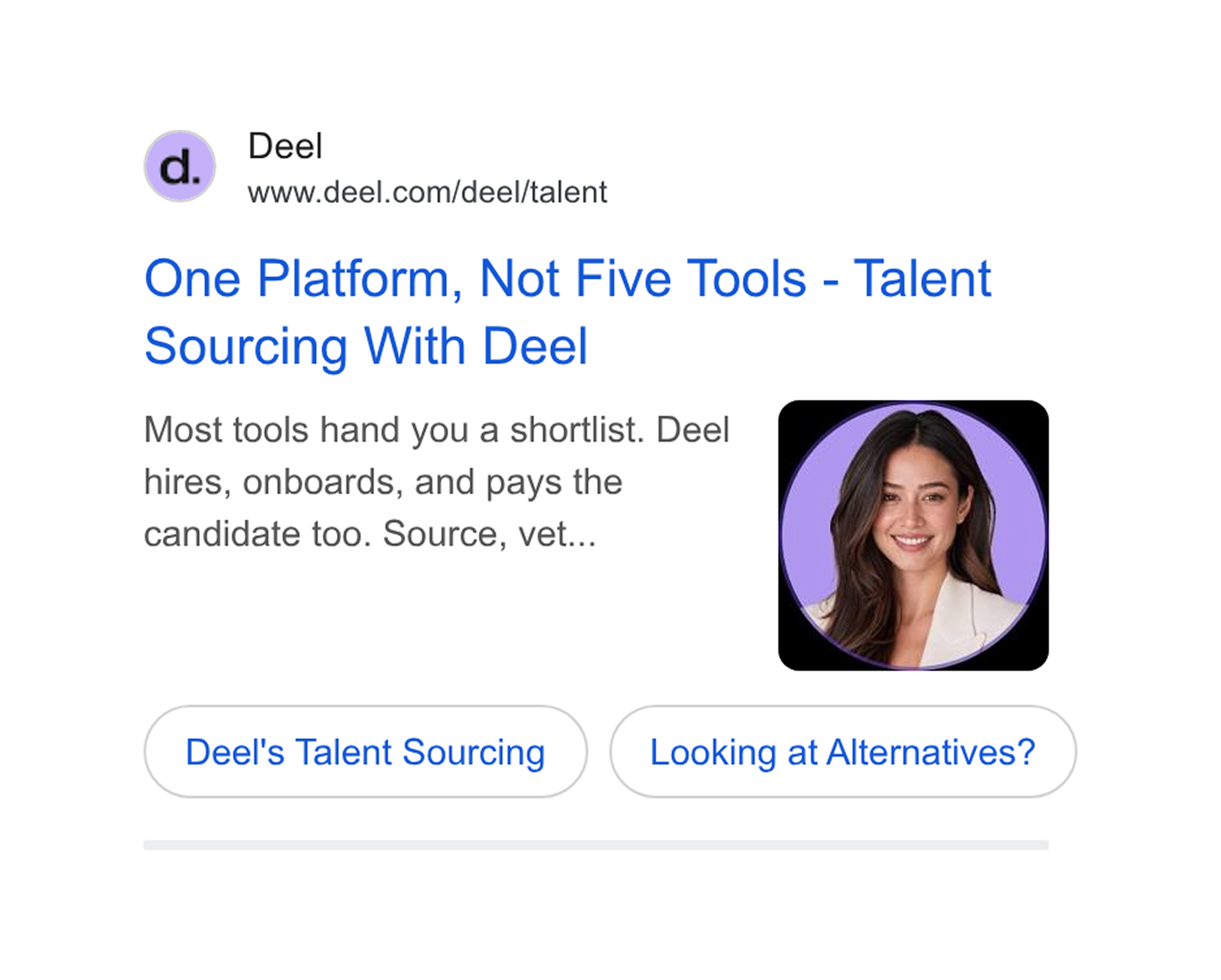
Total ads tested: ~10,000 (Google)
Runtime: 1,042 days
Why it converts: Prospects searching on Google and Bing are often already aware of solutions and specific tools that can solve their problem. That’s why search ads should highlight the unique selling points that set a product apart from competitors. Deel’s search ad does exactly that. It calls out competitors for their limited features while positioning Deel as the more complete recruiting and payroll solution. The image of a female persona on the right supports the copy and acts as a visual scroll stopper.
Example 17 - monday.com (Link to ad library)
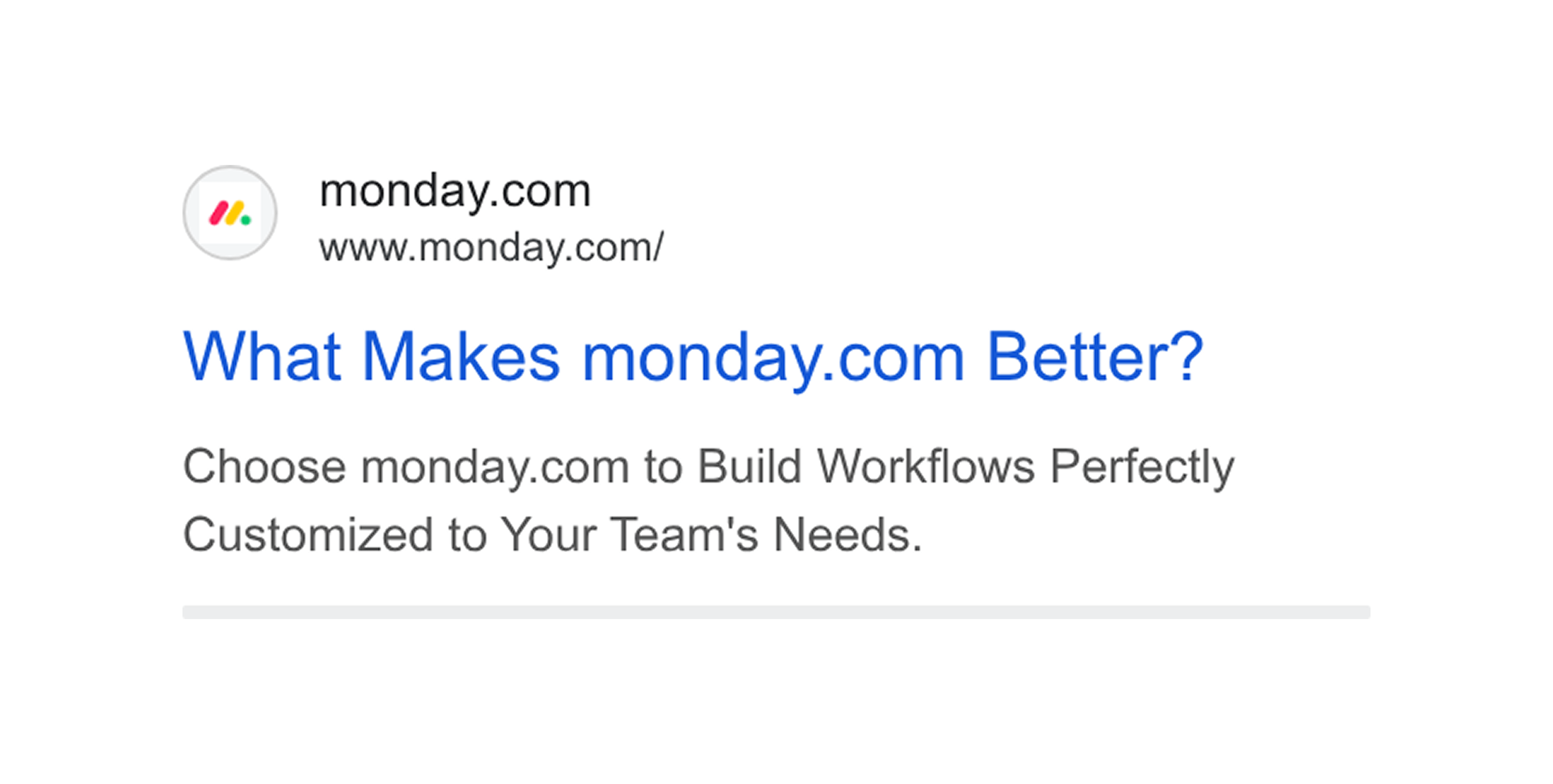
Total ads tested: ~30,000 (Google)
Runtime: 1,075 days
Why it converts: Competitor ads are one of the most common uses of search ads. Advertisers bid on a rival’s brand name so their ad shows up above the rival’s own site. In this context, monday.com builds tension by asking the obvious question and prompting searchers to click and take a look.
Example 18 - Figma (Link to ad library)
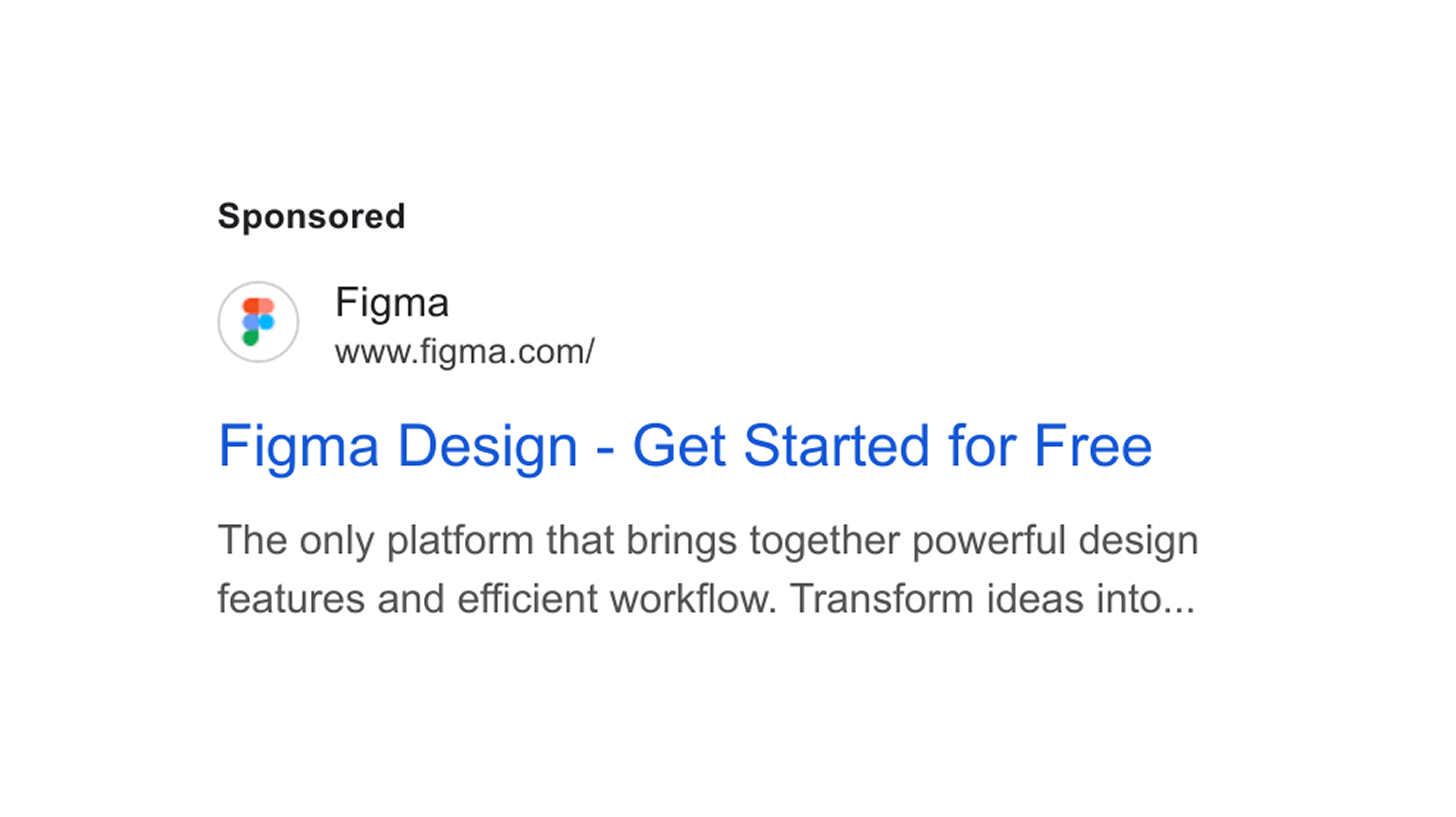
Total ads tested: ~2,000 (Google)
Runtime: 957 days
Why it converts: Effective search ads read like an offer, stacking benefits to sell the click. And what’s more convincing than getting something for free? That’s why Figma leads with a free trial here, one of the most reliable ways for B2B SaaS companies to increase click-through rates.
Thought leadership ads
Thought leadership ads are specific to LinkedIn. With this type of ad, brands promote content from LinkedIn members, such as employees or external content creators.
The main advantage is that the ads are run through a personal profile rather than a company page. People are more likely to connect with real humans, which is why thought leadership ads usually have higher engagement rates.
Example 19 - Perspective (Link to ad library)
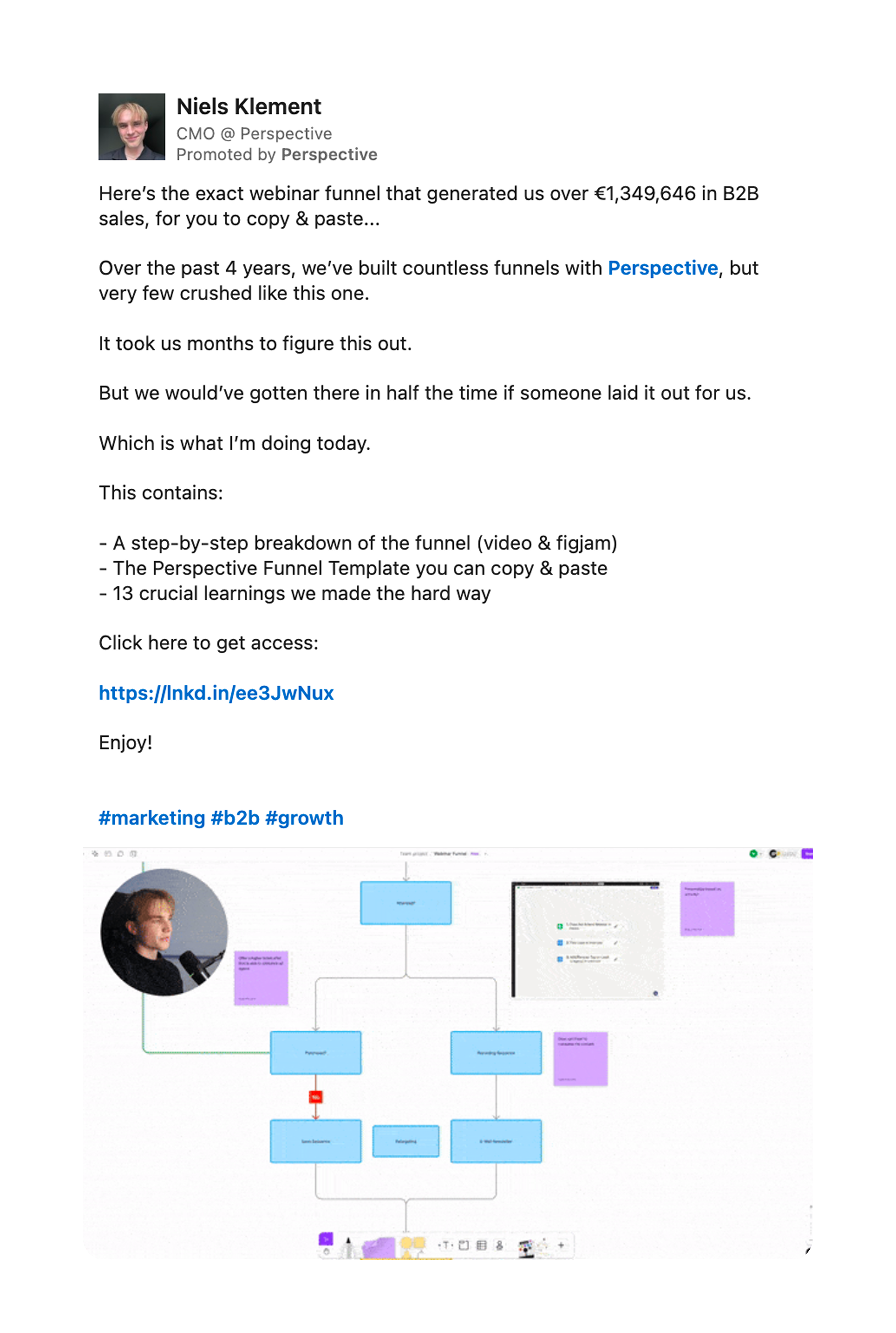
Total ads tested: ~1,300 (LinkedIn)
Runtime: 661 days
Why it converts: A specific number (”€1,349,646”) catches the reader’s attention, while “copy & paste” promises results with minimal effort. Instead of pitching Perspective, the ad offers a free funnel breakdown, a template and crucial learnings. It sells the click, not the product.
Example 20 - Chatbase (Link to ad library)
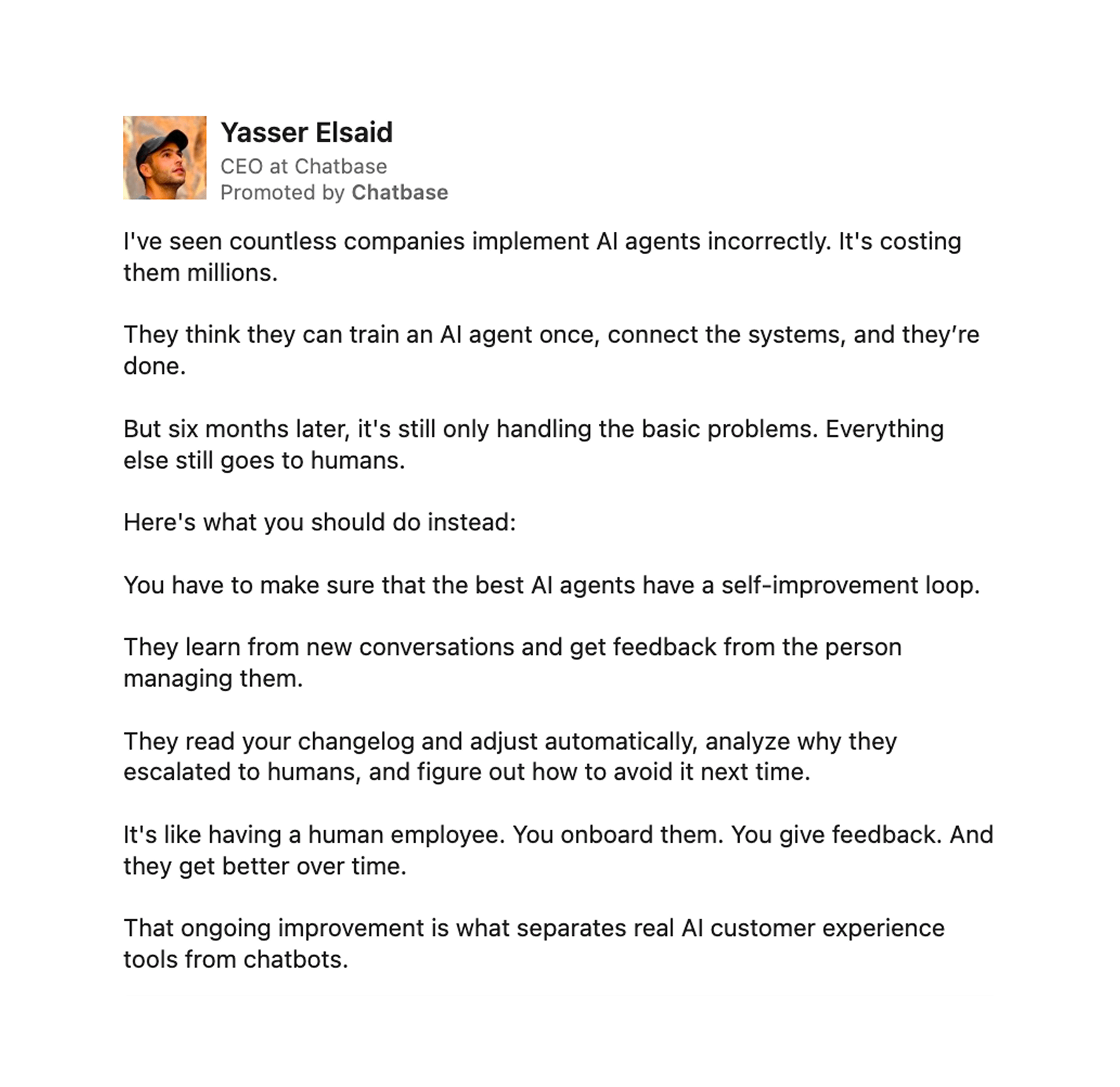
Total ads tested: ~800 (LinkedIn)
Runtime: 145 days
Why it converts: Chatbase cleverly nests promotion inside its own founder’s POV. The post speaks to an unaware audience and hooks them with a serious financial risk related to faulty, one-time-only AI implementation. A scenario that potential Chatbase customers can relate to. The post then goes on to introduce the solution of “self-improving loops”, a core feature of Chatbase’s chatbot solution.
How to apply these examples to your own campaigns
You know the theory, now it’s time to bring that knowledge to life. The following skill will help you create winning SaaS ads based on your company’s profile. Here’s how it works:
Download the skill file and upload it into your favorite AI chat tool. I recommend using Claude when working with image ads, and Gemini when working with video ads.
When you first run the skill, it will ask you to create a company profile. This company profile will then be used for each of the skill’s three main components…
Ideator: Produces six new ad ideas based on your company profile.
Translator: Translates an external reference ad into an ad concept for your company.
Reviewer: Grades your own ad drafts and provides fixes to increase their performance.
Subscribe to Get Hooked! Marketing
By Fabian Rabenalt